Fantastic posters and how to make them
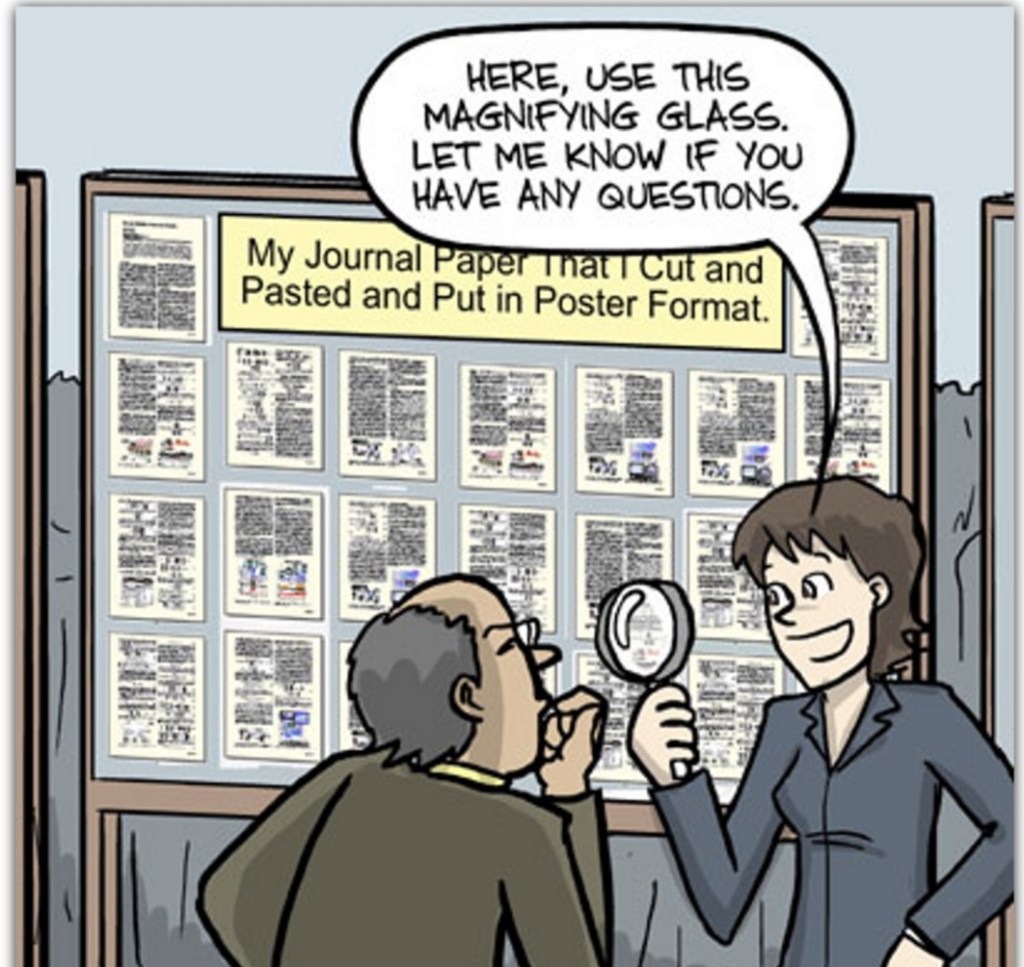
It’s that time of the year again, time to make a poster! I’ll be doing at least a couple this year to display some of the work I’ve been doing, but the current one I’m in the process of finishing up is for the summer conference the hospital holds. They sent out a template and a example poster from last year’s event, but the example was bad. Like really bad. So maybe we need to talk about what makes a good poster, because apparently people think they need to be books.
There’s always someone who creates a powerpoint slide and it’s just a wall of text. Nobody is reading that, nobody has time for that, and I don’t understand why people keep doing it. You’ve seen it done, I’ve seen it done, and it keeps happening! Personally, I’m a text minimalist when it comes to powerpoint sides. The less text the better, you’re giving a talk and the slides should supplement your talk, not replace you. In fact, most of my slides are no added text slides (aside from title). I bring this up because the same rule applies to posters.
When presenting a poster you need to think of it less as a novel and more like a children’s picture book. Sure, there can be text, there should be text, and there WILL be text. But just like a child’s book, the text should be minimal, large, and if it can be explained in a picture, it should be! There are a lot of different ways to build out your poster, but mostly you want to use a lot of figures and some short supplementary text.
This is double important if the primary purpose of your poster is so you can talk about the work you did, sort of like a single slide powerpoint. You want to give enough information on the poster that a person could make sense of it without you, but you also don’t want to have ALL the information there, there’s a subtle, but important difference. Your poster isn’t a replacement for a journal paper, it doesn’t need to go into excruciating detail, just enough detail that we can figure out a few key facts. 1) What you did, 2) Why it’s important, and 3) What you found out. That’s it and you can do each of those things in just a few sentances.
For my latest poster, I have two sentences describing the problem, one discussing the current treatment, one for my hypothesis, five for the methods, one for future work and one very large, very prominent sentence letting people know why this was important. Those sentences are grouped together in no more than groups (paragraphs) of two sentences. Even two separate points shouldn’t be crammed together, add white space. Why is that important?
Well unlike say, a blog for example, posters should be bite sized bits of information. For example:
The average years of life left to someone after spinal cord injury hasn’t improved since the 1980’s.
That’s it, I’ve introduced the problem. Boom. And that was done in a single concise sentence. I can (and would) expand upon it when I’m presenting and that’s the whole point. One or two sentences more can introduce what is currently being done, or what we typically refer to as the state of the art. I spent most of my sentences in the methods. I have 3 paragraphs, or really 1-2 sentences with spaces between to make it easier for the reader, for a total of 5 sentences. That is literally the most text I have on my poster in one spot and a good part of the space that text is taking up is white space. More than half and closer to 75% of the space I allotted for my methods section is taken up by a figure demonstrating how we set everything up. So the text mostly just describes what the figure is showing.
Most of my poster is figures, they take up more than 75% of the space on my poster since that’s the whole point of a poster, to show your work. Honestly I would’ve used more space for figures if I could manage to fit them, but I got what I needed onto the poster so it worked out. Sometimes you need to be creative on how you arrange your figures to make them fit the poster. The problem is we make figures for papers, which are paper sized, but posters are typically wider than they are long, so you need to adjust accordingly.
Which brings me to poster arrangements. I have my own special template that I like to use that has become semi-popular for posters where the main point of the paper, the BIG takeaway message is places literally center in big lettering. But why tell, when I can show. Here’s the stripped down (IE nothing added) version of my poster. I literally just deleted all the figures and text from my latest poster to make this.
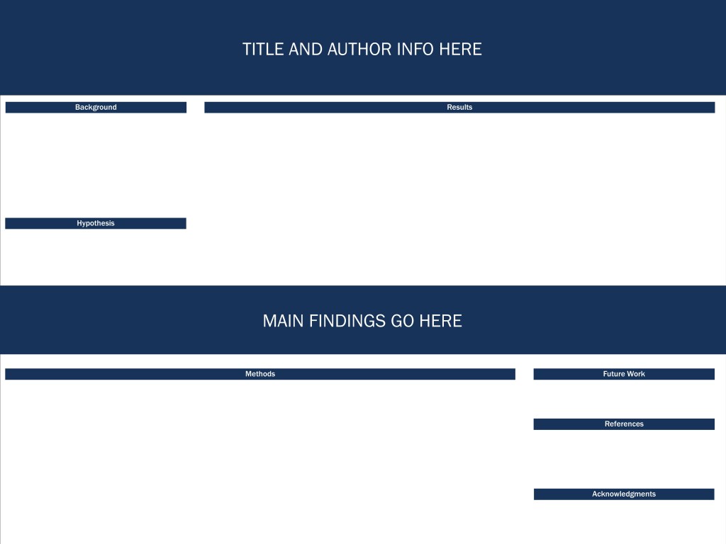
The font size for the “main findings go here” section is much larger than anything on the poster (including the title and author info), right now I have it at 88 point font and the title is “only” 75 point font. As for the text in my poster, the minimum for the conference is supposedly 24 point, but that is way too small! I would use 24 point for references and acknowledgements maybe (currently I have them set at 28), but the rest of the text on my poster is 32 point font. First, it makes it easier to read at a distance, second there are people who have trouble reading smaller fonts (even 24 point) at a distance, and third you don’t need that much text on a poster. I promise you, you don’t need it.
In my case, the results section has zero added text. Admittedly there is text in my figures to label my axes, to describe things, ect. but there’s no added text, at all. This is because everything in my results section is a product of the methods we used and since I describe our methods, it follows logically what the results will be (i.e. what we measured). There are titles to my figures which tie it all together, but since the methods outlines what we did, what we got needs no extra words.
You’ll also notice my sections may feel a bit out of order. My methods are on the bottom and results on top. This is intentional because the top section will be mostly eye level and I want people to be looking at my results. I can direct people to the methods, explain whatever I want, but really what we found is the most important thing so it’s up front and right in your face.
So to wrap this up, a quick recap of suggestions you may want to think about while making a poster:
- Can you remove more of the text? Less text the better!
- Use “strategic” whitespace to break up text. Aim for less than 3 sentences in one block
- Still too much text, take out more.
- Figures should be LARGE
- Text should be LARGER than the suggested minimum for any conference, by a significant amount
- Seriously, even less text, aim for 200-250 words max.
- Put your main finding front and center
Again, because I CANNOT stress this enough. If your poster looks more like this blog post than a child’s picture book you’re doing something wrong. I promise you don’t need all that text. I promise there will be no one reading it anyway, so just take it out. Life is too short to make posters with huge walls of text. We can do better, we have the technology.
Now, go out there and make a great poster!


I’ve seen my share of “wall of text” PowerPoints. Here at work, I think it sometimes happens because people are trying to make them double as a presentation aid and a document of record. So they stuff them with info as if someone will be reading them a year later when the presenter’s not around. No no no save me that is not what PowerPoints are for. Write an actual report if you need depth.
We even have some PowerPoints here that function as deliverable documents: your sketch of the design you’re planning to do and your presentation of it to the group are the same thing, with no supporting paper. Fortunately these are just for early reviews – there will be a proper design document written later – and when I do one I try to keep it in line with regular PowerPoint etiquette.
So yes. Slim and visual is better. Presentations and posters are the one place I’ll agree with that, even though I generally seem to prefer text-over-images more than the average person.
LikeLiked by 1 person
July 21, 2022 at 7:47 pm
Oh no! I agree that an actual report would be better if you need detail. Presentations should be talks and you can print out slides and they often let you print them with a section to take notes if you want for a reason.
I never thought of a powerpoint as a deliverable, but I guess it makes sense in a weird sort of way. It’s easy to review at least and keeps you (hopefully) from creating a full on report!
LikeLiked by 1 person
July 22, 2022 at 12:06 pm