EEG Cleaning: ICA and Dipoles
Let it be known that I’m a person of my word and today we’re going to give a rather broad overview of ICA and dipoles. Don’t know what those words mean? Well start here and that will give you a high level view of the entire process. Today we’re going to do a slightly deeper dive into what the heck a dipole is, why we use it for ICA and why ICA is so helpful in EEG data processing. Sound like a lot? Well it is, but let’s take a crack at it anyway!
Once again, we’re doing a high level overview. This would be best suited for people starting out, people curious, or people who just want to know how we can read brain info! I won’t go into the math and I’ll try to make this as interesting as possible. First let’s talk about the software we use for this type of analysis.
EEG hardware is becoming pretty common these days. OpenBCI for example offers cheap ways for someone to get started at home without the university setting/funding. While the hardware is getting cheaper, your data are only as good as the tools you use to process it. In our lab we rely heavily on MATLAB, but we also use a few open source tools that are basically scripts for MATLAB. Now there are other non-MATLAB related tools out there to play with, but today we’re focusing on how I do things, so MATLAB it is.
The two main add-ons we use are EEGlab and FieldTrip. They are complementary tools and chances are if you’re using one, you’re using the other. Now EEGlab has a handy graphical interface, but I don’t use it and prefer the command line. Side note, I never thought I would say that when I started, but here we are. FieldTrip on the other hand only has scripts, so no interface, you just use the tools they give you via the command line in MATLAB. Both are great and while we rely on both, I’ve somewhat heavily (depending on your definition of heavy)modified the scripts they provide to better suit me and my preferences.That being said, if what I show you looks different from what you do/use then that’s probably because I’ve made a few changes over the years.
Now let’s define a few things, first a dipole. We talked about this yesterday, but when the neurons in the brain fire, they create basically two poles (think magnet) a positive pole and a negative pole. Using enough EEG sensors we can estimate where in the brain that dipole is located and use that information to help us determine if what we are seeing is noise or some other non-brain related artifact. To do this we rely on inverse models, which gives us a problem we call (you may have guessed) the inverse problem (read more). In short, it’s accurate…ish, we’re getting better, but it’s still not great. It will do for our purposes though!
Now let’s talk ICA. Independent component analysis is what we do when we look at independent components (duh). In EEG we can break down the signal into individual components (IC’s), one per sensor used. There’s a lot of math behind how and why this works, but the point is we can use it to (surprisingly accurately) separate out noise sources from actual neural data. Things like eye blinks, heart beat (yep, we can sometimes pick that up in EEG), EMG or muscle movements from the scalp/neck/etc., and electrode pops, which is a fancy term for movement of the electrode relative to the scalp, and a whole lot of other noise that we get from EEG recordings.
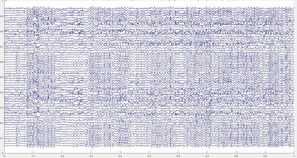
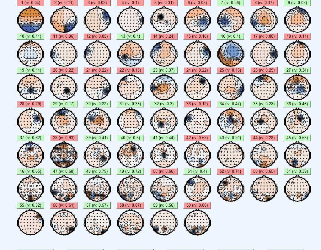
This cannot be done real-time, but when we’re studying the brain we don’t always need real-time answers. In my case I’m working with a dataset to test a few assumptions, so we don’t, for example, need to control a prosthetic or anything like that. So since in our lab we use 64-channels of EEG, but 4 are reserved for EOG or eye movement recordings, we are left with 60 channels of EEG which using ICA and dipfit (fitting dipoles to the data) we end up with 60 dipoles and 60 IC’s. When we plot that, it looks something like this.
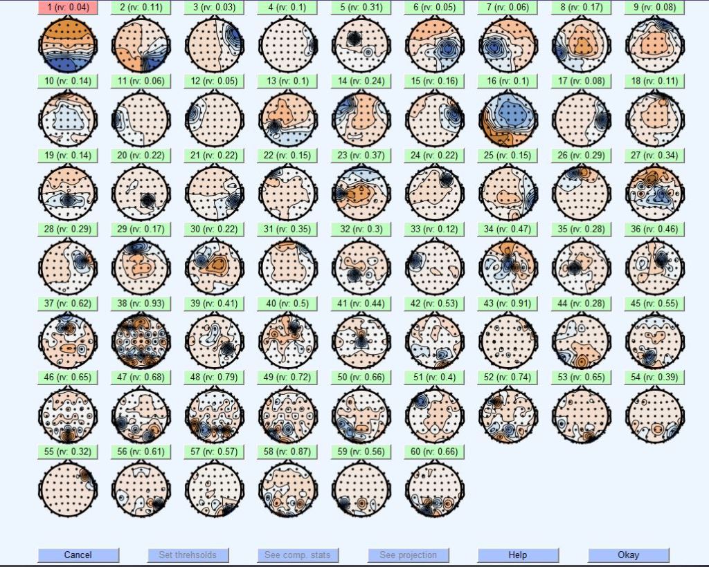
This is a giant plot of all my individual IC’s, now I need to go into them one at a time and decide if I keep it or toss it. Once I finish all of them I can rebuild my signal using the remaining IC’s and it looks like magic, but it’s actually a lot of math. This is one of the scripts I modified, I changed the plot colors to match all my other plots so I wouldn’t get confused by different colors in different plots. You’ll see what I mean in a second. Now to analyse the IC you just click on one of the green buttons. That red button? I tossed that already because it was a 10 Hz artifact I picked up in the room from some electrical equipment nearby (not sure what exactly).
Each IC gives a rv or residual variance. This tells me how well the IC explains the signal it’s representing a low rv is good a high rv usually (not always!) means artifact. A low rv can be an artifact too, like the first IC that’s red, it just means that it represents the artifact really well and in my dataset that is the case a lot of times because of how I did the experiment. Now let’s click on the second IC the one with a rv: 0.11 or 11% residual variance, surely that isn’t an artifact… right?
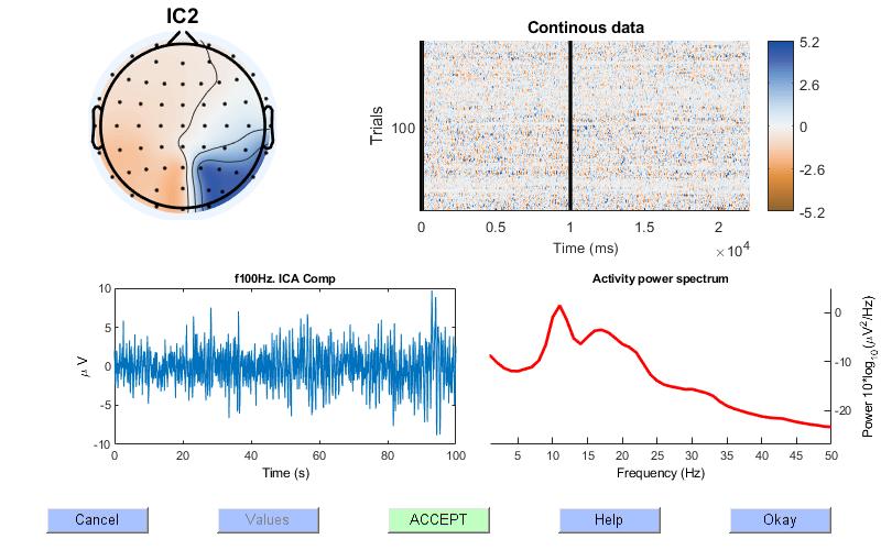
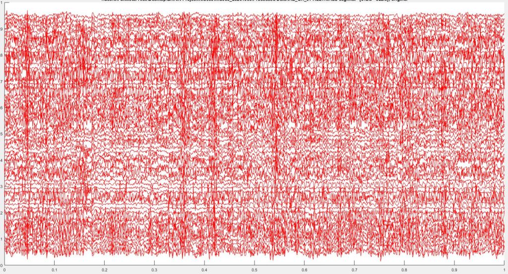
Here’s the plot of the IC, now we can ignore the top right plot since that is not how I performed my experiment, so it automatically segments the data. If I had performed an experiment that had a lot of trials this would allow me to compare across all the trials. In this particular dataset I did not, so we ignore it and instead look at the topoplot (the left top plot), which tells me there was high activity in the blue regions and lower activity in the brown. I can also look at the bottom left plot which shows the raw data, or at least 100 seconds of it, and the bottom right which gives me the power spectral density (PSD) of the IC.
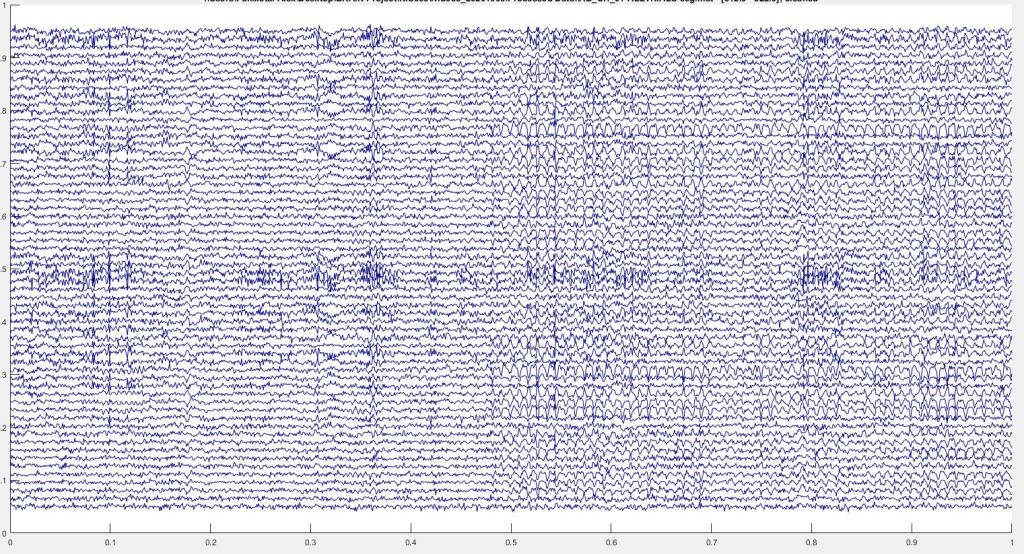
In the body the PSD should show a 1/f behavior, which is not what we see, the lower frequencies should have a higher power than the higher frequencies (hence 1/f). So the line should look more like this IC shown below. It’s not perfect, but it’s better than the one we see above and that 10 Hz bump actually could be neural activity, I haven’t looked at it closely enough to decide yet.

Okay so back to IC2. Thankfully there are other ways we can analyze this IC to determine if it. Namely we can look closer at the data and we can also look at where the dipole is located. First, let’s look at the third plot of this IC, this is the IC properties for IC2 (the one we’ve been working with except for that last plot shown above).
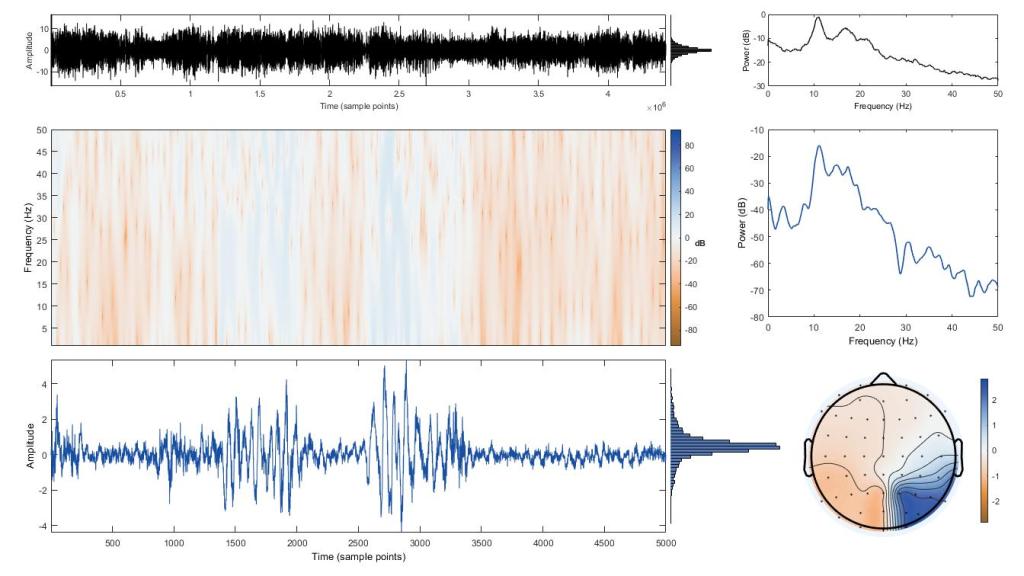
Already I can tell that this IC had that ~10 Hz noise that I picked up from the room I performed this experiment in. The top plot is the entire IC, basically a whole hour and a half of data. The middle left plot is a spectrogram (which there are a few old posts I wrote about them, that is one of them) of the smaller portion of the data shown in the bottom left plot. I can change what’s plotted by clicking different sections of the top data.
The top right is the same PSD for the entire dataset we saw and the bottom right is the same topoplot, but the middle right is the PSD of the window of data shown in the bottom left plot. Confusing? Maybe, but you get used to working with it. Below is a different section of the data (notice the lines in the top left plot showing were I am in the dataset. If the dataset was smaller you would see two lines signifying the window of data shown in the other plots, but because we have such a large dataset, you basically only see a line).
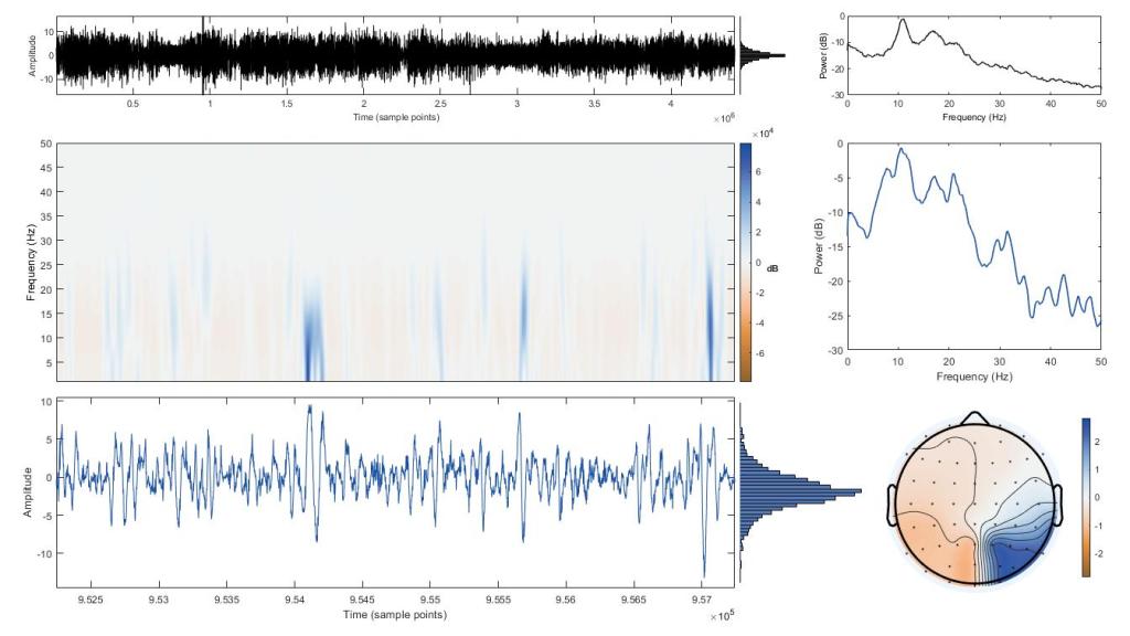
By now you can see why I standardized the color scheme across the plots. So looking at the data above we see once again that the damned 10 Hz signal is still there. This is actually a good thing because it shows that the IC captured that noise really well and we can reject it, thus removing it from our data! Before we do that though let’s look at the dipole and see where in the brain the signal was supposedly coming from.
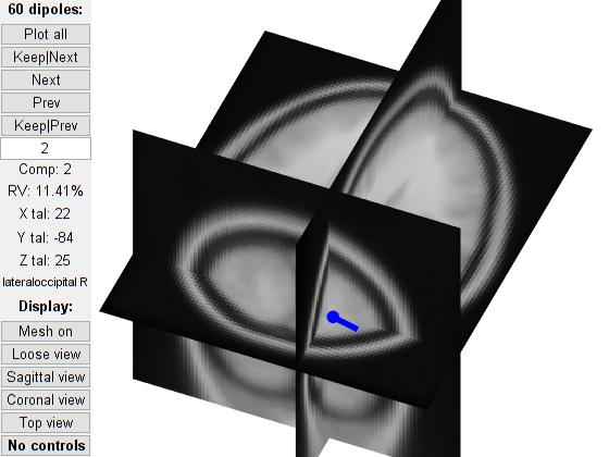
So this is hard to read (ish) but this is the back of the head and the dipole is estimated to be in the brain volume so that’s handy. What you’re seeing is MRI slices of the brain, the blue dot is out dipole and the line coming off of it is where it’s “pointed” notice the topoplots above (the circle plots with the nose pointing up and two ears), the activity is in the same area and the blue is to the right side of the plot, the same direction as our dipole. That’s why dipole estimation is so useful. We can also cluster the dipoles across subjects to find similar activity, but we won’t get into that now.
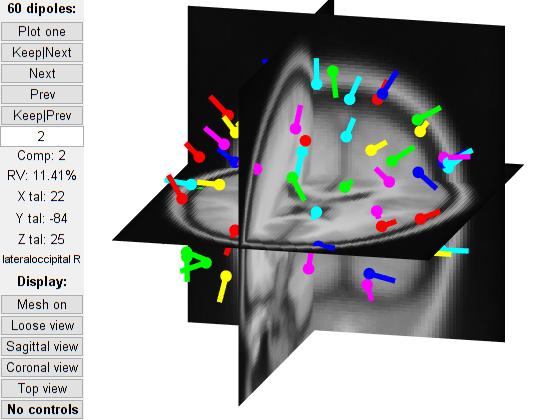
Just for fun, I can plot all the dipoles so you can get an idea of what that looks like as well. Below is a shot of all the dipoles for this dataset and some are in the brain volume and others are not even close (some are in the sinus cavity for example and in other datasets I’ve seen them very far away from the entire MRI of the head). This highlights the difficulties in working with EEG data. No single way of looking at the data tells us the whole story, so we use all these plots (we’re at four per dipole already) to get a fuller picture of what we’re seeing.
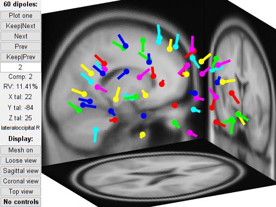
Here’s another shot with the axes set to loose view which means they are the far ends of the MRI so you can see the dipoles floating around an invisible head in space basically. It highlights how these look a little better than the above plot, but the above plot is my prefered way of looking at it (with a single dipole of course). So much so that I rewrote the code to plot my preferences as the default, which wasn’t as easy as you may thing, at least for the single dipole.
So even though I’ve only shown you two sections of this IC, it’s noise so I’m taking it out of my dataset. Not only is it full of 10 Hz pops of data from the environmental noise, it also contains a few other artifacts I want to eliminate. I’ll go through this process for each and every IC and dipole to figure out what to keep and what to toss. The whole process start to finish takes me ~ 3 hours a dataset (I mean, 60 IC’s is a lot). You can do it a lot quicker, but I prefer being thorough now so I don’t have problems with the data later.
If you want to learn how to tell what is noise and what is neural there’s a fun (?) game you can play found here. That’s actually how I learned how to do this at first, it takes a lot of practice, but again the end result is magical. No matter how many ICs you keep, the code returns 60 channels of data with the ICs you removed taken out of the dataset. I can go back in and remove more ICs later if I want, but once they are gone, if I want them back I need to start with the original dataset.
Since I care so much, I went through and finished this dataset. Below shows which ICs I kept and which ones I discarded. Not all datasets keep the same number, so it’s more of an example than a rule for how many you should end up with. I had to process the data anyway, so might as well do it for the post.
Now, I rebuild my dataset with the cleaned ICs (the ones I have selected). That’s a separate bit of code, but thankfully it’s super fast, in the order of seconds. Which if you ask me is anticlimactic after all the work you put into cleaning it. Now this part is hard, but we can look at the before and after since I always save a copy of the dataset prior to cleaning. This way I can compare afterwards to see how well it was cleaned. By the way when I say cleaned, I mean removing noise, it’s a term we use a lot so forgive me for not defining it earlier. Below is a couple of shots showing before cleaning (top), after cleaning (middle), and the difference between the two (bottom).

Now that’s just a small portion of the data, but you can see a huge difference. Like I said, magic! So now that we’ve gone over what ICA and dipoles are, how we use them, and the end result. I think that wraps everything up. Hopefully you’ve learned a lot and have a good overview of how the process works!
Back to work I go and if you’re doing something similar, good luck!


Interesting, and I will probably have to read it a few times and still not understand it. It is cool to see the workings of what all those squiggly lines are when an EEG or EKG is done, they seem similar. When I look at the tech and doctors when they are reading my EEGs, time and again, I often think, “Do they really see something in all those lines?” Thanks this insight…very helpful to this lay person.
LikeLiked by 1 person
November 23, 2020 at 3:03 pm
That’s good to hear. I always worry that I either talk too much about the non-important stuff or don’t give enough detail for the complex stuff. Reading raw EEG data is pretty much not possible, but noticing artifacts and things in the data isn’t hard. The fun stuff is when we correlate certain activity location and type (say a spike at 10 Hz in a certain part of the brain) with a behavior, then we can use that information to control things like prosthetics or computer mice. In our lab, we’ve used EEG to control an exoskeleton with a fair amount of accuracy. It’s super cool and I love the work we do.
LikeLiked by 1 person
November 23, 2020 at 6:56 pm
No, I have experienced so much with my health and spent hundreds maybe thousands of hours in a medical library on the City of Hope campus in Duarte, CA. I was told my AVM was inoperable and I knew there had to be something out there and there was, Lars Leksell and the Gamma Knife. People like you, researchers and scientists, affect lives with your work, so keep on writing. It will be a great album for you to look back on…ooops sorry, this old lady over medicated….
LikeLiked by 1 person
November 23, 2020 at 7:33 pm
Pingback: The long data processing road | Lunatic Laboratories