Day 9: Reading a Spectrogram
Definitely not the same spectrogram as yesterday, no really look. Now for the part where I tell you how to read this thing…
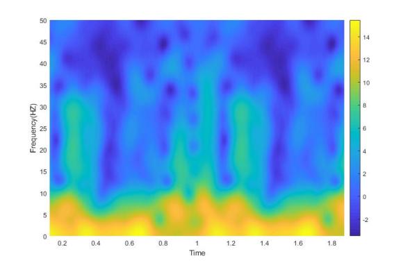
Last post we introduced a new tool in our arsenal of signal processing analysis, the spectrogram. Without knowing how to read it, it just looks sort of like a colored mess. Don’t get me wrong, it is an interesting looking colored mess, but a mess nonetheless. Well today we are going to talk about how to interpret the plot and why exactly we would ever use this seeming monstrosity.*
If you’ve already read my last post introducing the spectrogram you might be a bit confused. We are using the Fourier transform to produce this output, but when we used the fourier transform previously to determine our PSD we ended up with a boring ol’ squiggle of a line. Granted that line can tell us a lot about the function we are looking at, but if we are using the Fourier transform again for the spectrogram, why do we get colors and not a line?
Well, first let’s talk about why we have so much color and I gave a hint last post, that the spectrogram was three dimensions of fun! It’s true, we are working with three dimensions. In this case, if we look at the above image we can see time (x-axis) and frequency (y-axis), but hidden in there is the third dimension (cue twilight zone theme). The third dimension is power (z-axis), but because we usually look at the image in two dimensions we use color to represent power, this makes it easier to read, but for demonstration purposes, let’s rotate the axis around so we can see all three dimensions.
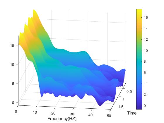
Rotated spectrogram showing all three dimensions. Notice we have the time and frequency axis as we did in the above image, but now we can see a third (unlabeled) axis, this is the power of the signal.
As we can see, the lower frequencies are higher power. We truncated the signal to show zero to fifty Hz, but you can see even with just this bit of the signal, it gets hard to read when you attempt to view all three dimensions. Just for fun, let’s rotate it a little more and see if it looks any better.
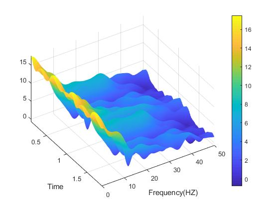
Further rotated spectrogram showing all three dimensions. Still sort of hard to read because we are viewing all three dimensions at once.
See, the problem is still there, we have three dimensions and visualizing all three at once is hard to do, so we use color to represent the third dimension and use time and frequency for the x and y axis respectively. This makes it easier to interpret and gives us an easy to follow standard everyone to use. You can adjust the color scheme, but the bar along the right side shows what colors represent a particular part of the power spectrum. Now let’s talk about what the difference is between the spectrogram and power spectral density and why we get two very different results using the same Fourier transform!
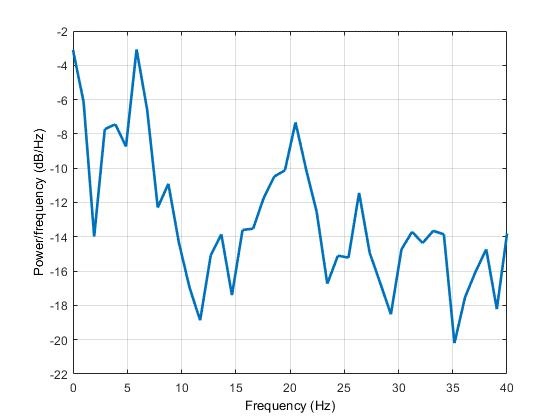
Power spectral density of the above signal, notice it looks very… different from our spectrogram data.
For those who don’t remember what a PSD looks like, above we have the power spectral density plot for the same signal. But if both plots use the Fourier transform, why are they so different? Well the answer to your question is in time. No, really, look again at the PSD, there is no time dimension. This is the difference between the PSD and the spectrogram data, imagine if we took the spectrogram data and rotated it so you could only see the power and frequency axises, that is almost what we are looking at, the PSD is the average across time for the entire signal. The spectrogram in contrast is the PSD calculated for individual windows of time and extrapolated between windows (because we are looking at a window of time).
This is why our selection for the variables (nfft, window size, overlap, etc) is so important, because when we calculate the spectrogram we can end up with a phenomenon called streaking or data that ends up looking blocky. However, I think we’ve covered quite a bit today, so we can discuss all that some other post. We also need to go over something called the banana of uncertainty (okay that’s not what it’s called officially, but it’s a good name and it’s name gives you an idea about the shape of this uncertainty), so yeah lot’s to cover. On the brightside with 356 days left in the 365 DoA, we have time!
As always, don’t stop learning!
*The usual reminder here, I make no claim to the accuracy of this information, some of it might be wrong. I’m learning, which is why I’m doing this. If you’re reading this then you are probably trying to learn too. If you see something that is not correct, or if you want to expand on something, please do it. Let’s learn together!!


But enough about us, what about you?