Day 10: Spectrogram vs. the banana of uncertainty
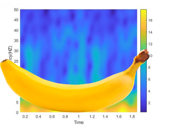
The banana of uncertainty (okay, it’s not a real banana)
Well ten days in and we’ve just introduced the idea of the spectrogram. While a lot of this information is just the broad strokes, I like to think that we’ve covered enough to give you a good idea about how to use these tools and what they are used for. However, we do need to discuss a limitation to the spectrogram, something called the banana of uncertainty, okay not quite the name, but you’ll see why I keep calling it that.*
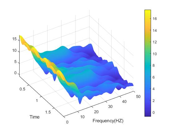
Last post I covered a particularly interesting looking method to visualize your three dimensional data (data over time, frequency and power) using the spectrogram. Like all good tools we can use the spectrogram to provide information that might be hard to convey using other methods, we saw a good example of this when we tried to rotate the spectrogram to visualize all three dimensions shown again below.
The spectrogram is really useful because we can see changes in power over time and frequency, something that you may not see using other methods such as using an ensemble averaging where you may not have time locked signals, don’t worry we will cover this later and if I remember I’ll link here to it, if not and you are reading this well after the 365 DoA, then just search for it, I’m sure I will (or have) covered it.
Like any good tool in our toolbox we need to know not only how to use it, but also its limitations. Enter the banana of uncertainty, or more properly known as the cone of influence (not as fun to say). This goes back to the Fourier transform and isn’t necessarily an issue with the tool, but it is definitely a limitation. Furthermore this problem comes up when you use other methods to convert to the frequency domain (such as wavelets) so like it or not we have to deal with this issue. Now, what does the banana of uncertainty cone of influence look like? It is banana shaped really and we can see a good example of this below in the shaded area.
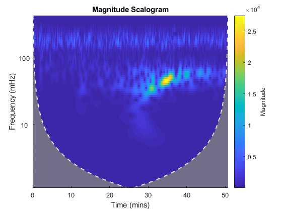
Here you can see the cone of influence (or the banana of uncertainty), this is where edge effects of the data make the power estimation less accurate. Compare to the banana added in the image above and you can see why the name works.
You can see why I keep calling it the banana of uncertainty, it really is basically banana shaped. However, we haven’t really covered what it is or what it means. The shaded area is where the edge effects impact the power estimation. This is why the shape is a cone (or banana) the edges of the input signal are what is effected and because lower frequencies need a higher time to resolve (ie – 1 Hz frequency takes 1 second and you are going to want at least a few windows before you can say accurately estimate your power). Thus, as we increase our frequency, we need less time to estimate the power of our signal and we end up with this cone (or banana) shaped uncertain area.
Eagle eyed readers will notice the title, scalogram, not spectrogram. They are almost the same thing, scalograms use wavelets where spectrograms use the Fourier transform (which we’ve covered). Like I mentioned above, the issue is the same no matter which method you are applying. Interestingly enough, a quick online search about the cone of influence heavily favors wavelets (scalogram), but I assure you that it is an issue for both methods.
So what do we do to avoid this? Well, we eliminate the edges of our data when we are analyzing something. For example we try to take data a few seconds (or even minutes) before whatever signal we are studying and a few seconds (or again minutes) after the event has occurred. This way, we can eliminate the edge effects and have more accurate data without having to contend with the uncertainty. It isn’t the most elegant solution, but it is a very simple one. Additionally, if you have data with multiple instances of an occurrence, it is best to run your spectrogram on the full length of the data before segmenting it into the areas you are interested for this very reason.
Well I think that about covers the banana of uncertainty. Next up we can talk about why we use the spectrogram over ensemble averaging or rather why spectrograms do something different. We sort of touched on it here, but it will be good to cover it in a little more detail.
Until next time, don’t stop learning!
*Remember, I make no claim to the accuracy of this information, some of it might be wrong. I’m learning, which is why I’m doing this. If you’re reading this then you are probably trying to learn too. If you see something that is not correct, or if you want to expand on something, please do it. Let’s learn together!!


But enough about us, what about you?