Day 11: Why even use the spectrogram?

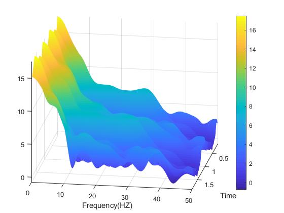
A spectrogram plot rotated so we can see all three dimensions.
So you wanna use a spectrogram… but why? What does a spectrogram do that we can’t do using some other methods for signal processing? As it turns out, there is a lot of reasons you may want to use the spectrogram and today we are going to cover some of those reasons and number four may shock you! (okay not really, what do you think this is a clickbait website?)*
Day 10: Spectrogram vs. the banana of uncertainty

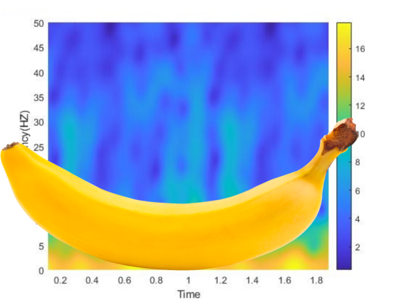
The banana of uncertainty (okay, it’s not a real banana)
Well ten days in and we’ve just introduced the idea of the spectrogram. While a lot of this information is just the broad strokes, I like to think that we’ve covered enough to give you a good idea about how to use these tools and what they are used for. However, we do need to discuss a limitation to the spectrogram, something called the banana of uncertainty, okay not quite the name, but you’ll see why I keep calling it that.*
Day 9: Reading a Spectrogram
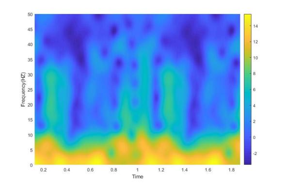
Definitely not the same spectrogram as yesterday, no really look. Now for the part where I tell you how to read this thing…
Last post we introduced a new tool in our arsenal of signal processing analysis, the spectrogram. Without knowing how to read it, it just looks sort of like a colored mess. Don’t get me wrong, it is an interesting looking colored mess, but a mess nonetheless. Well today we are going to talk about how to interpret the plot and why exactly we would ever use this seeming monstrosity.*
Day 8: The Spectrogram Function

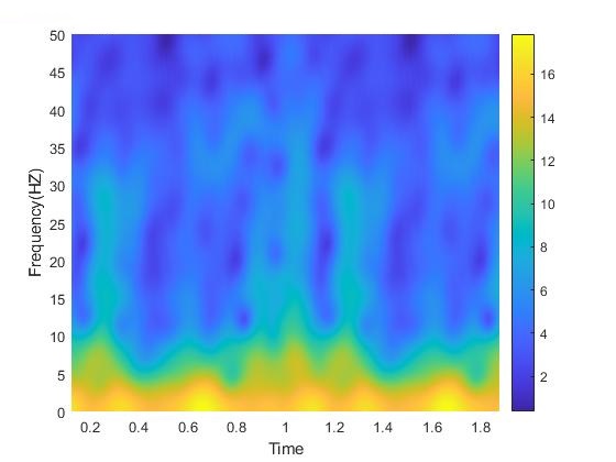
Example spectrogram from some data I had recently processed
To (somewhat) continue with our signal processing theme that we have going on at the moment, over the next few days, let’s look at something called the spectrogram. It’s three dimensions of fun!*
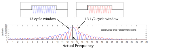
Day 6: The fast and the Fourier
A good example of how the Fourier transform can approximate signals. The red signal is our input signal and the blue shows how the output of the Fourier transform.
Okay, if you’ve been keeping up with these posts, we know about Welch’s method, Thomson’s method, the things that make them different, and the things that make them similar. The thing that both of these transforms rely on is the Fourier transform. What is the Fourier transform? Well, something I probably should have covered first, but whatever this is my blog we do it in whatever order we feel like, so let’s dive in!*
Day 5: Whose window function is it anyway?

This is not how we use a window function on the computer…
One day someone looked at the windowed fourier transform and said, “Don’t be such a square!” and thus window functions were invented. If you believe that, then I have an island for sale, real cheap. But seriously, let’s do a dive into what a window function is and why the heck there are so many of them, because there ARE a LOT! So let’s get started!*
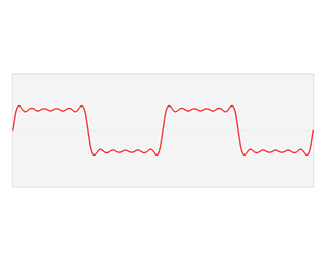
Day 4: Spectral leakage… embarrassing

Look at that leakage!
Leakage, it’s never a good thing. For today’s post we’re going to cover a very important topic. Spectral leakage, it’s a big reason why spectral density estimation is well, an estimation. The other reason it is an estimation is because the fourier transform is an approximation of the original signal, but the Fourier transform is a whole other post on its own. So let’s talk leakage!*
Day 3: Power Spectral Density Overview


In our last post we introduced the two main characters in this story of spectrogram. On one end we have Welch’s method (pwelch) on the other end we have the Thomson multitaper method (pmtm). As promised here is a awful basic breakdown of why is more than one way to compute power spectral density (in fact there are several, far more than the two I’m talking about). So, let’s just dig right in!*


