The third lecture!?


It’s time! Okay not quite, but very soon! It’s time for the last of my summer lectures for the interns and I’m excited to wrap this up and focus on other work. There’s a lot going on so maybe first we’ll talk about how my schedule conflict shaped up, what I’ll be teaching, and why I love this class so much. I’ve been debating about making a seperate post to share the knowledge. Since I did that last year, with the classes I’m teaching this year, I don’t know if it makes sense. Maybe a review would be in order anyway…
(more…)The Nyquist frequency


A few days ago I realized I had never bothered to explain the nyquist frequency. Considering it’s been over a year now since I explained some of the frequency domain things that I do in my lab, I’m actually surprised I missed something so important. Well, better late than never today we’re going to explain the nyquist frequency and why it matters… to my work at least.
(more…)Fact or artifact


A new turn in the saga of my data processing. There has been some concern that the artifact from the stimulation is causing the thing I am seeing in my data. There are arguments to be made for both sides, but let’s go over what that could mean for me.
(more…)Day 99: Data request, a update


Sometimes emails can still be exciting!
I’ve got news! In my last post on the subject I said that I wasn’t expecting a response from the lab I was requesting data from until Monday, if at all. Well would you believe I got a response! It wasn’t a “here’s the data response,” but it is progress. Let me explain why.
Day 97: Neural network models

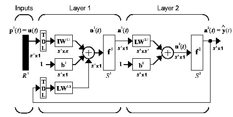
Today should be an interesting day for me. I plan to do a deep dive into the world of neural networks to better understand how they work and the best type to apply to my data. There are a few, quite a few in fact that I could use and really it depends on how I want to frame my problem, so let’s look at what I’ve got planned.
Day 87: Classifier progress

Well it’s been an interesting experience. I’ve been working hard to train a binary classifier to predict the two classes in my data. There has been a lot of ups and downs and more importantly, there has been some progress. It isn’t perfect, but it’s a start, so let’s look at what I’ve got so far and where I’m headed.
Day 15: Significance, Part 3

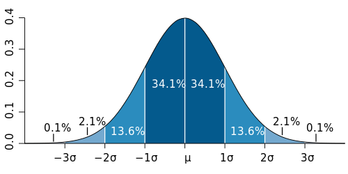
Where does our observation fall on the probability density function?
It looks like we’ve arrived at part 3 of what is now officially a trilogy of posts on statistical significance. There is so much more to say I don’t want to quite call this the conclusion. Instead, let’s give a quick review of where we left off and we can get back to determining if an observed value is significant.*
Day 14: Significance, Part 2

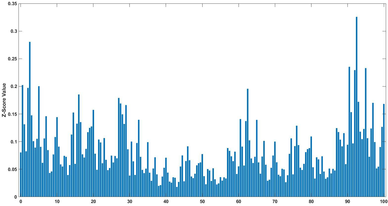
Z-score bar graph that I made just for all of you using some data I had laying around. If you’re new to statistics it may not make sense, but rest assured we will make sense of it all!
Well here we are two weeks into 365DoA, I was excited until I realized that puts us at 3.8356% of the way done. So if you remember from last post we’ve started our significance talk, as in what does it mean to have a value that is significant, what does that mean exactly, and how to do we find out? Today is the day I finally break, we’re going to have to do some math. Despite my best efforts I don’t think we can finish the significance discussion without it and still manage to make sense. With that, let’s just dive in.*
Day 13: Significance, Part 1

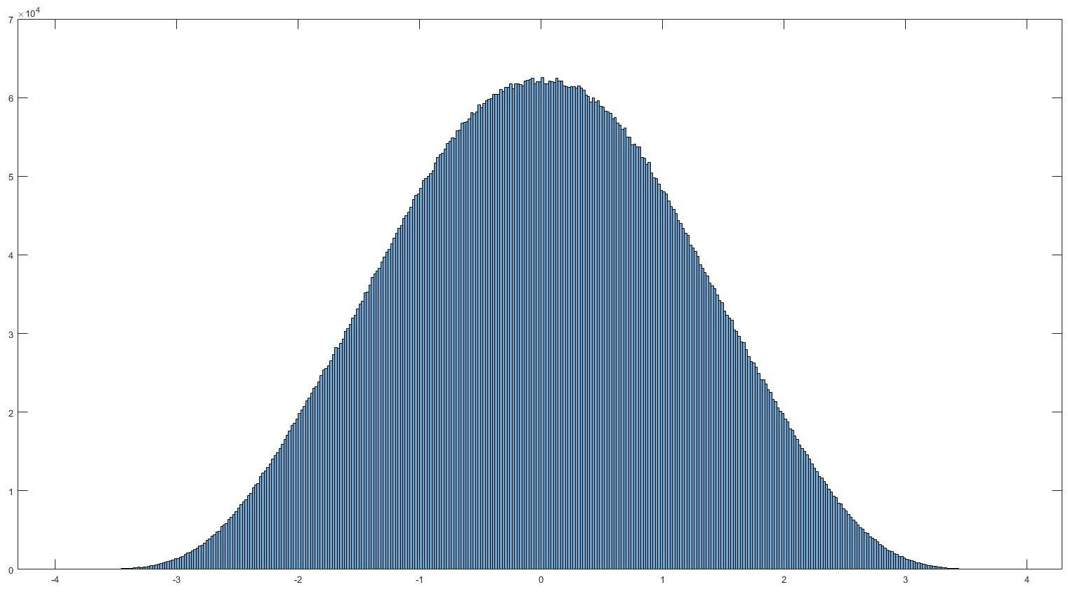
Histogram of normally distributed data. It looks very… nomal. No it really is normally distributed, read on to find out what that means and how we can use it.
If you’ve read my last post I hinted that today we would discuss filtering. Instead I think I want to take this a different direction. That isn’t to say we won’t go over filtering, we most definitely will. Today I want to cover something else though, significance. So you’ve recorded your signal, took an ensemble average, and now how do we tell if it actually means something, or if you are looking at an artificial or arbitrary separation in your data (IE two separate conditions lead to no difference in your data). Let’s look at significance.*
Day 12: Signal, cutting through the noise

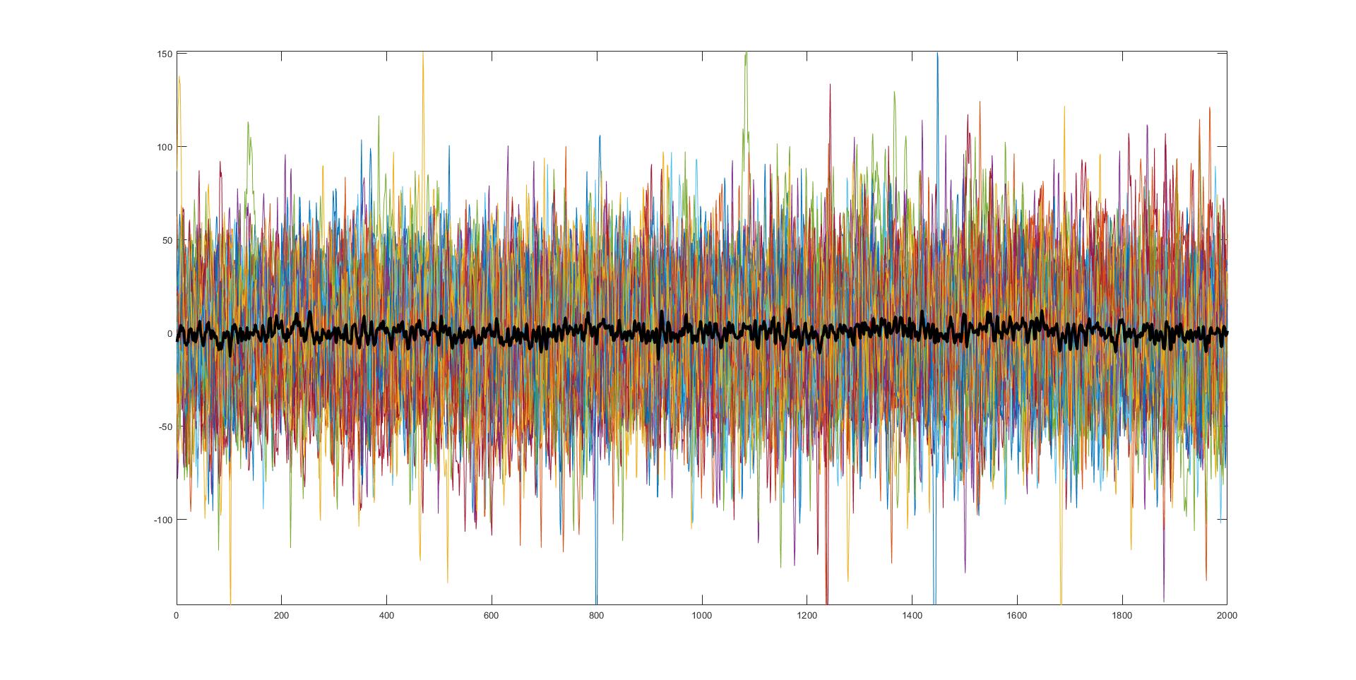
45 separate trials of very noisy data with the average of those trials (black). Believe it or not, this is actually very useful and very real data from something I am currently working on.
Noise, it can be troublesome. Whether you are studying and someone is being loud or you are trying to record something, noise is everywhere <stern look at people who talk during movies>. Interestingly enough the concept of noise in a signal recording sense isn’t all too different from dealing with talkative movie goers, so let’s talk noise!*
Day 11: Why even use the spectrogram?

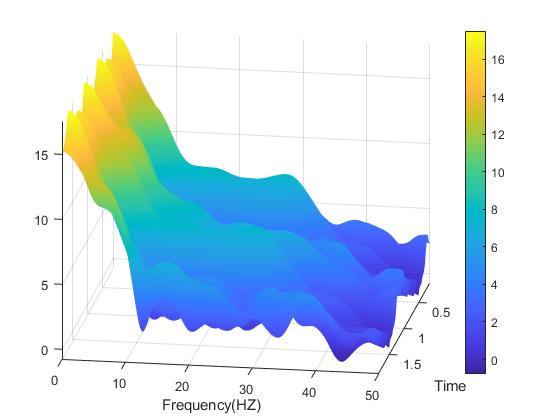
A spectrogram plot rotated so we can see all three dimensions.
So you wanna use a spectrogram… but why? What does a spectrogram do that we can’t do using some other methods for signal processing? As it turns out, there is a lot of reasons you may want to use the spectrogram and today we are going to cover some of those reasons and number four may shock you! (okay not really, what do you think this is a clickbait website?)*
Day 10: Spectrogram vs. the banana of uncertainty

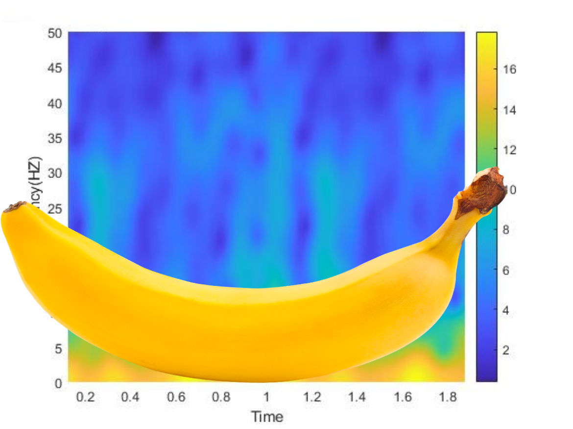
The banana of uncertainty (okay, it’s not a real banana)
Well ten days in and we’ve just introduced the idea of the spectrogram. While a lot of this information is just the broad strokes, I like to think that we’ve covered enough to give you a good idea about how to use these tools and what they are used for. However, we do need to discuss a limitation to the spectrogram, something called the banana of uncertainty, okay not quite the name, but you’ll see why I keep calling it that.*
Day 9: Reading a Spectrogram
Definitely not the same spectrogram as yesterday, no really look. Now for the part where I tell you how to read this thing…
Last post we introduced a new tool in our arsenal of signal processing analysis, the spectrogram. Without knowing how to read it, it just looks sort of like a colored mess. Don’t get me wrong, it is an interesting looking colored mess, but a mess nonetheless. Well today we are going to talk about how to interpret the plot and why exactly we would ever use this seeming monstrosity.*
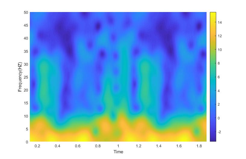
Day 8: The Spectrogram Function


Example spectrogram from some data I had recently processed
To (somewhat) continue with our signal processing theme that we have going on at the moment, over the next few days, let’s look at something called the spectrogram. It’s three dimensions of fun!*
Day 7: Small waves, or wavelets!

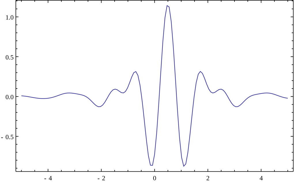
This is the Meyer wave, a representation of a so-called mother wavelet function to use for the wavelet transform. Notice that it is finite!
Waves! We’re officially one week through 365 Days of Academia! Woo! 1 week down, 51(.142…) weeks left! Let’s wrap up this weeks theme (there wasn’t originally a theme, but it kind of ended up that way) by talking about other ways we can get to the frequency domain. Specifically, let’s stop the wave puns and let’s talk wavelets!*
Day 6: The fast and the Fourier
A good example of how the Fourier transform can approximate signals. The red signal is our input signal and the blue shows how the output of the Fourier transform.
Okay, if you’ve been keeping up with these posts, we know about Welch’s method, Thomson’s method, the things that make them different, and the things that make them similar. The thing that both of these transforms rely on is the Fourier transform. What is the Fourier transform? Well, something I probably should have covered first, but whatever this is my blog we do it in whatever order we feel like, so let’s dive in!*
Day 5: Whose window function is it anyway?


This is not how we use a window function on the computer…
One day someone looked at the windowed fourier transform and said, “Don’t be such a square!” and thus window functions were invented. If you believe that, then I have an island for sale, real cheap. But seriously, let’s do a dive into what a window function is and why the heck there are so many of them, because there ARE a LOT! So let’s get started!*
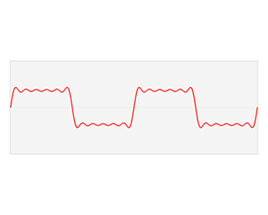
Day 4: Spectral leakage… embarrassing

Look at that leakage!
Leakage, it’s never a good thing. For today’s post we’re going to cover a very important topic. Spectral leakage, it’s a big reason why spectral density estimation is well, an estimation. The other reason it is an estimation is because the fourier transform is an approximation of the original signal, but the Fourier transform is a whole other post on its own. So let’s talk leakage!*
Day 3: Power Spectral Density Overview


In our last post we introduced the two main characters in this story of spectrogram. On one end we have Welch’s method (pwelch) on the other end we have the Thomson multitaper method (pmtm). As promised here is a awful basic breakdown of why is more than one way to compute power spectral density (in fact there are several, far more than the two I’m talking about). So, let’s just dig right in!*
Day 2: Power Spectral Density (pmtm)

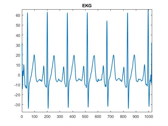
A example EKG signal
This is a (somewhat) continuation on what we were discussing in the previous post. We covered the pwelch MATLAB function, this time we will cover the PMTM function, this function uses the Thomson multitaper method to calculate power spectral density. We can do a deep dive into the differences between the two next time, but for now let’s talk about the command itself.*
Day 1: Power Spectral Density (pwelch)
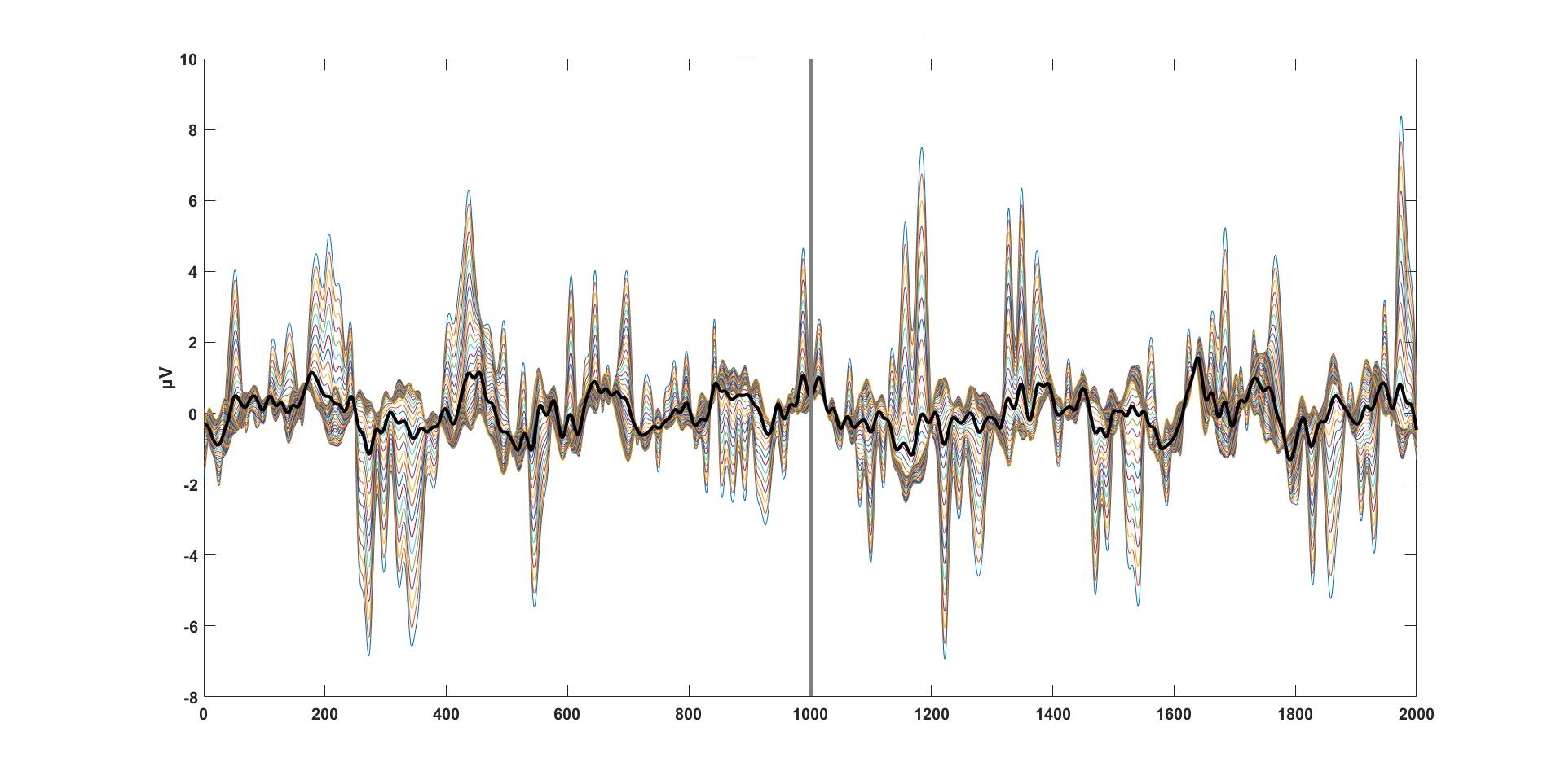
Some EEG data that I’ve aligned, processed, and made look nice and pretty.
Signal processing, it’s complex, there are a million ways to go about processing a signal, and like life, there is no best way to go about doing it. Trust me, it is as frustrating as it sounds. Today’s scratch pad note is on power spectral density or PSD for short. So let’s dive in.*


