Fabric conference posters!
It’s here!!!!! My poster is finally here and let me just say it looks great! I’m thrilled with how it came out and the last post on the topic (here) discussed why using a fabric company over a school based company was a great idea, mostly because of the level of expected quality so I won’t be talking about that today. Instead I think I’ll cover why I’m so thrilled, but also how I managed to get it printed, because that’s a story. Although, the linked how-to guide in the previous post on the matter does a great job, I figured I could pass along some other advice. Namely, what to do now that I need to cut it to size…!!!
First let me just say it’s been a pretty good day in terms of stuff showing up. The poster is here it looks better than I could’ve hoped for and now I just need to figure out how to cut it to size since the fabric is bigger than the actual printed poster. I also (for a seperate post) got the fancy copy of my patent today, which was super fast turn around! For those who don’t know, it was approved back on October 18th I believe, but I didn’t find out until a couple of days ago and today the physical copy of the patent showed up and man does it look fancy compared to the last one! I’m really happy about that and again, another post for another time, but I wanted to lump the good news. The business cards showed up as well, but that was a bit of a bummer because they had printing errors so we may be either reverting back to the old ones or using the new ones and just pretending it was intentional. The short version is there was basically two colors that get stacked on each other and the bottom layer was shifted slightly so it was visible and it doesn’t look bad exactly, it just doesn’t look how I wanted it to look, so boo on that front!
Anyway the poster! Since I can’t show the full thing, I did take a sneaky picture of it so you can see for yourself the quality of the print. This was tricky to do, but I managed to get a shot I felt comfortable sharing. Eventually you’ll get to see the full thing along with some photos of the actual event, but don’t wait for them because that probably won’t happen until after I’m graduated.
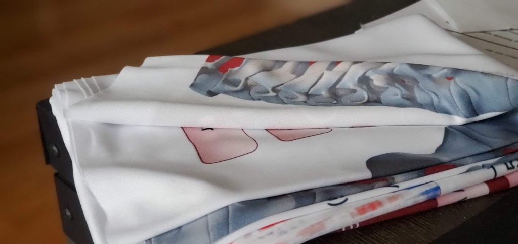
For anyone confused as to what you’re looking at, well that’s the point, but I can say the bit showing is just the 3D model I created of my spinal column, as in my actual spinal column, but that’s easy and you can do one yourself (here!), there are probably easier ways to do it, but that’s my trusted way, as in the one I have years of experience using so I don’t feel like changing!!! Anywho, in powerpoint you can insert and manipulate 3D models (as in rotate them in 3D space). It’s a cool feature and one I never really thought about until I made my poster and realized I could use it here.
All in all the colors are bright, the images are very clear, and the most important part (IMO) the text is clear and large enough to easily read! Like I mentioned when I sent it off to print, getting a handle on what it will look like in the final version, as in full-size physical copy, is not easy! Sometimes you (I) get nervous that things are too small, but things look good in this case, even the smallest text, which was the author list, funding, and school logo are all very large. Large enough that I probably could’ve gone smaller, but I prefer larger font sizes over smaller ones.
Now I’ve never used Spoonflower before (and again I get zero money from plugging them, they don’t know I exist and I had no clue they existed until recently, which is exactly what I said on the last post about this), but I’m glad I went through them. The material is super soft and is something you could seriously turn into a blanket or a piece of clothing even. I’m debating about what to do with this after the conference, but assuming school-PI doesn’t want to keep it (technically I’m getting reimbursed for it so it’s his) I will probably turn it into some sort of blanket or maybe even a cat bed. It would be a shame to waste the material, but I also like the poster itself enough to keep it around if I can find a good use for it.
Normally in the past, when I print posters like this, even the most “fabric” of fabric materials feels almost like thin plastic or tarp even. It’s hard to describe if you’ve never got a plastic “fabric” poster before, but they are definitely not, “turn into a blanket” material. The fabric, because it’s real fabric, has the fabric texture to it and is visible on the poster itself. You can probably see it in the photo if you squint really hard, the fabric has a tight knit to it, but it’s not paper so it’s noticeable. To me, that’s a plus, it gives the poster a texture to it, but if that’s not your thing or you think it looks bad then by all means poster tube away! The fabric isn’t super thick which is good for traveling, you can see in the photo I have it lightly folded and it doesn’t take up a whole lot of space even like that. Since it’s fabric though it’s pretty sturdy so I don’t have to worry about tearing it.
Spoonflower has a ton of different fabric options too, well ton to me I think it’s like 6-8 choices, which is 5-7 more than I needed. However, seeing the poster I am wondering what it would look like if I had selected a different material. I may experiment next poster by printing on something else even though they recommend. Okay I stopped being lazy and looked, they actually have 24 choices of fabric if I counted correctly. They aren’t all the same width though, so you need to be mindful of that if you’re feeling experimental or you’ll end up with half a poster because you selected “pettal signature cotton” (42 inches wide) instead of “celosia velvet.” (54 inches wide). If you’re an unrefined fabric ruffian like me and can’t tell “belgian linen” from “poly crepe de chine,” then I would check out the fabric types section to get a rundown on the different properties of the material.
For example, even though they recommend “performance piqué” for fabric posters, I am kind of eyeing the “fleece” for a less textured, but fun look. Or maybe a “Celosia Velvet” would make for a fun poster since it is described as having a plush feel. If I’m feeling really bold and wanted to make a statement I would totally go with the “Minky!” It’s furry!!!!!!! You could have a furry poster, if I would’ve had more time between when I ordered and the conference I would’ve seriously considered it for the entertainment value. Everyone would want to pet your poster, I mean how could you resist!?!
If I were doing some sort of research where I could incorporate the texture into it I (like fuzzy coral or maybe some sort of animal?!) I would do it in a heartbeat. Posters should be fun and thinking about texture and what not may seem overwhelming on the surface, but it could be so much fun and make for a memorable poster. If it’s one piece of advice I can offer, it’s don’t take yourself too seriously, if you’re going to do all the work to make a poster, then you should have fun with it!
Okay now that I’ve geeked out over “Minky” I should probably move on, but I mean really though are you going to pass up the chance? I hope not!
There is one bit I wanted to mention about Spoonflower. You can’t use pdf or powerpoint, which is a shame, but whatever you just need to save it as an image. Unfortunately it’s a bit of a convoluted process, you need to save as a pdf, then save the pdf as an image or I think they walk you through a few different options. Before I found the guide, I figured the easiest way to do it would be to increase the maximum save resolution from powerpoint. Now when I saved it originally from powerpoint it was 90 DPI or dots per inch and Spoonflower recommends 150 DPI, the less DPI the worse your poster will look. They also suggest you don’t need to go over the 150 DPI since it doesn’t add any extra improvement from their experience. I unfortunately did not read that prior to uploading and so mine was 240 DPI, but that was what powerpoint generated and I could change the DPI in the order to match it, speaking of which…
MAKE SURE YOU DO ADJUTS THE DPI BEFORE ORDERING IF IT’S NOT 150!!! IT CHANGES THE WAY THE POSTER IS PRINTED!!!!!!!
Yes that’s a lot of caps, it’s important!
To change the way powerpoint saves, if you feel like going that route, I did since I would like to order again in the future and I didn’t want to do the multiple application dance, it’s actually pretty easy once you know what you’re doing. It involves going into your register editor though and that can be dangerous, but it’s basically harmless if you don’t mess with anything, please don’t mess with anything! To do that, just hit the start button and type regedit, then you will see a bunch of folders on the left window, you want (for powerpoint 2016, 2019, or 365 users):
Computer\HKEY_CURRENT_USER\SOFTWARE\Microsoft\Office\16.0\PowerPoint\Options
Finding the folder is really easy, just take it one level (\) at a time, note you need to go into Office then into 16.0 folder, then powerpoint. I had a powerpoint folder in the Office folder and it really confused me until I looked closer at the route I needed to take.
Once you’re sure you’re in the right folder, you should see a few different entries on the right pane. Right click on the white area and you’re going to create a new dword (32-bit value), there’s a 16-bit value and you don’t want that one so 32-bit value!! It will ask for a name, just call it ExportBitmapResolution and create it! Once it’s made either double click on it or right click and edit the value, you’ll have two options, hexadecimal and decimal, you want decimal then set it to 150 DPI and you are good to go! Click okay, close out, and save your powerpoint in image format, I prefer .jpg for this. Then right click the image you just made, go to details and scroll down. Eventually you’ll see an entry for vertical resolution and horizontal resolution, it should be 150 DPI if you did everything correctly.
If you’re not using one of the listed powerpoints above, here’s the link to find the folder in your registry you need to do work out of. It just makes my life easier to have it all preset for next time, plus having the DPI matching the default recommended size for a poster really means I don’t have to worry about screwing up the printing process. When I ordered I changed the DPI on the website from 150 to the 240 DPI my poster was in and I’ve been worried about it up to now because I wasn’t sure if it was going to affect anything (it didn’t thankfully), so don’t make this more difficult for yourself than needed.
Now that I have poster in hand, I feel a lot better about the conference. I’ve already got the other stuff under control so now it’s just practicing until the big event for the off chance I get selected for a stage presentation. I know I’ve said this numerous times, but Spoonflower was a great choice, so now I have a new go-to for posters when needed in the future (and they will most certainly be needed in the future!), hopefully between this post and the last I’ve convinced you to give fabric posters a shot, even if you don’t want to go the Spoonflower route, it’s worth it, I promise.
Happy conference season to all those who celebrate!


Before your first post about this, I didn’t even know that fabric posters were available. It’s the kind of thing that makes me wonder why I didn’t think of it, though; having something that can be folded without creasing makes so much sense.
I think I’ve been involved in printing at most two of those big conference posters, and that was over a decade ago, so if there have been advances since, I’m unsurprised.
Happy to hear that your poster turned out so well!
LikeLiked by 1 person
November 10, 2022 at 12:35 am
Thanks! I’m not too shocked it’s the first time you’ve heard of it since you’re not really a student and (I don’t think you) go to conferences to present. I do love not having to carry a poster tube around with me all the time!
LikeLiked by 1 person
November 10, 2022 at 9:24 pm