So much data
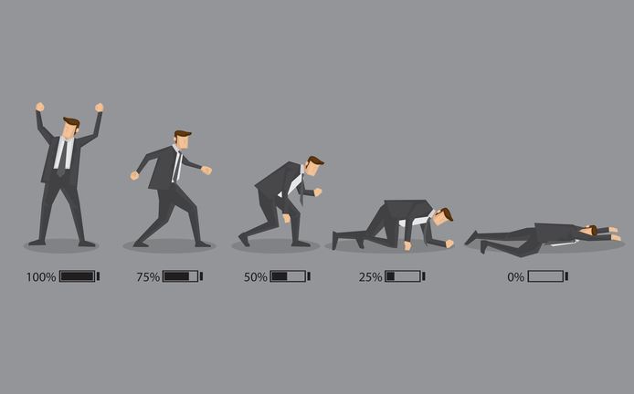
Well I’ve processed (poorly) about half of my data. Now, when I say poorly I just mean the visuals for it are garbage and I need to tweek the sizes and things to make it look nicer, but the idea is that I’m more interested in finding something than I am in making it look pretty. I’ve processed two of four of my subjects and well I’m excited!
In the words of Jay-z, “men lie, women lie, numbers don’t.” Well, as a scientist we know that isn’t true. Numbers lie all the time, the way we show them can make things seem… odd. A good example of this is a truncated axis, like the one shown below!
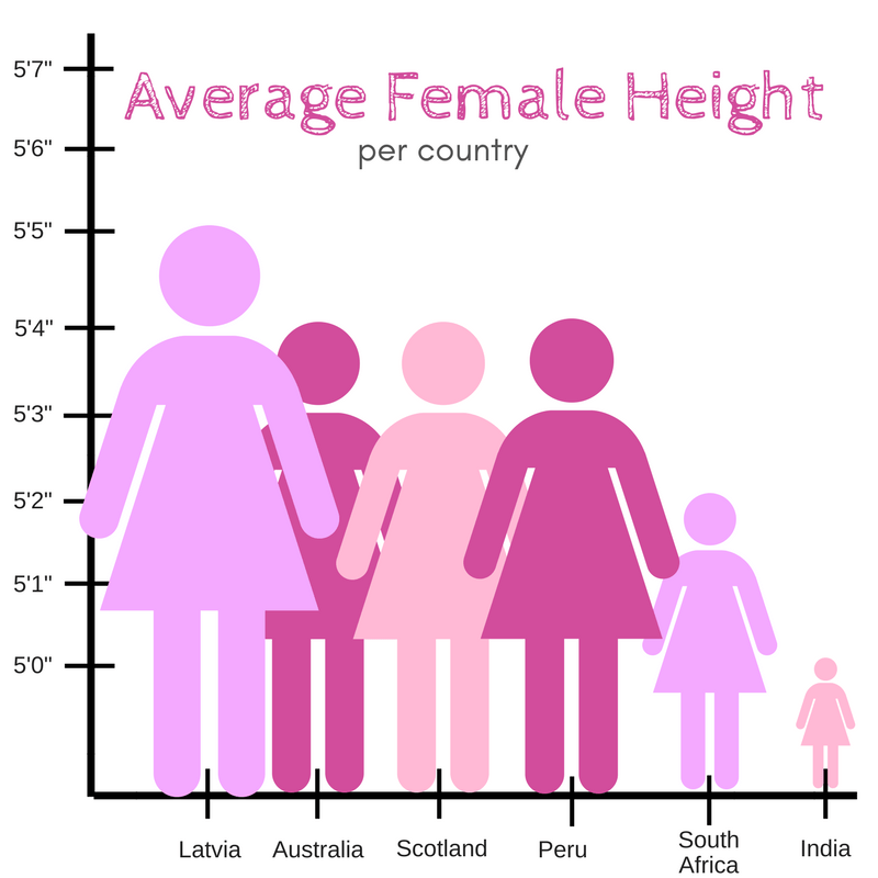
So visuals can be misleading and we as scientists need to be careful about how we showcase our data so we don’t make it look like Indian women could fit in the palm of a Latvian woman when really there’s like a 5 inch difference between them.
All this to say that we have best practices for showing our data in our lab and in my field and we try to stick with those practices so we don’t end up with the graphic above. This often times means using symmetrical axis (-5 to 5 for example) because our data is usually centered around zero. That’s important because if we didn’t do that we could have -2 and +5 for example and suddenly your visualization would look.
Say each of the numbers has a particular color associated with it let’s go blue at the negative to white at the center and red at the positive end. Suddenly our center is no longer 0, but 3.5 so we’ve changed the way the data looks without meaning to do so.
So with that, when I say my visuals look like garbage, it’s because the fonts are big, or the plots are squished together (not enough spacing between them), etc. The small things that make a visualization look less crowded and more easy to read. The data are plotted using best practices, but the plots need some adjustments to get them looking like something that would be publishable.
So today I’m going to rush through and get the last two subjects processed (hopefully) before my meeting today with my Co-PI to go over the results. He’s never processed data the way we do in my main PI’s lab, so I don’t think he realized how long it could take to do it. I’ve been rushing to meet the deadline, but it’s here! So back to work I go.


But enough about us, what about you?