EEG cleaning progress
Yesterday’s coding work went better than expected! That may or may not bode will for the rest of the week, but hey at least I’m sort of ahead of schedule. Today I figure we can take a quick look at what I’ve been doing with the data and why. This will be part informative and part me complaining about how everything has to be so damned hard (basically the usual around here). Mostly it will just be some visuals of the things I’ve had to change to get everything looking like my main-PI wants, he’s got a particular style he likes so a lot of large text, bolded labels, etc.
I’m convinced the third year of my PhD is going to kill me. If I survive at least, I’ll have some freedom to do the stuff I want to do. I just need to make it to the submission (or probably publication) of this paper. For those just joining I’m a third year PhD candidate in neuroengineering, I have my BS and MS in mechanical engineering and they are very different things! That doesn’t mean there’s no overlap, I’ve found the overlap and I’m taking advantage of the fact that at least some of this is vaguely familiar, but it’s been a learning process and my main-PI is pushing me to publish some data I collected so for the last week that’s basically all I’ve been working on.
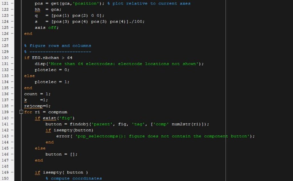
The code I’ve been using we’ve seen before (from my EEG cleaning overview). It’s part custom built tools from our lab and part MATLAB packages that we use for EEG data, EEGLAB and fieldtrip, both free unlike MATLAB. It’s functions on top of other functions that call on other functions. It keeps the code clean and short, but it also means I end up with about 50 different windows open any time I want to edit something. It also makes it slightly difficult to find the part of the code that does the thing I’m trying to change. I’ve quickly learned a lot about the style of the code, the way it was written and how to work with it.
Like I’ve said, working with another person’s code is like encountering a different dialect of a language you speak. It’s vaguely familiar, if you work hard enough you can make sense of it, but it’s also very different and not a simple translation. When I work with older code I’ve written at least I see a common theme. I mean every code I write is slightly different because practice makes perfect, or in my case slightly less bad. Even if I haven’t looked at it for awhile, it’s easy to fall back into the logic behind it. This is not as easy, but the more I go over it the easier it gets to understand it all.
So that’s the big overview of why working with this code has not been as simple as I would’ve liked. My main-PI kept listing off things he wanted me to change and adjust, some of which turned out to be easier than it I thought, but a lot of the easy things turned out to be very difficult. Let’s give a quick rundown of the changes that needed to be made, go over the challenges, and we’ll look at the result.
First was to change the timescale from samples to seconds. That (I thought) would be simple, we just divide by the sampling frequency (in EEG we typically, but not always, use 1000 Hz and that information is in the file you’re working with so this will auto adjust depending on the value in the file. The problem came from how the code plotted everything, there was a call to another function and that function created the updated plot (you can click on the time series and it will zoom to a 5 second window). So I needed to change the timescale of the plot, the updating function, and the window or I would end up with a 5000 second window instead of a 5 second window (because I wasn’t dividing by the sample frequency). I finally figured out how to do that without throwing in a bunch of division everywhere and that only took a few hours to solve.
The second change was adding the 95% confidence intervals to the data. When we look at EEG data in the frequency domain, we often times plot the 95% confidence intervals which tell us 1) how repeatable the data are and 2) when we compare conditions if one is statistically different from another. In this case the 95% confidence intervals will help me determine if the signal I’m reviewing is noise or actual signal. Ironically if it’s an artifact from outside (ie – line noise or some other electrical interference) the confidence intervals will be very tight because the noise would be very consistent so the confidence interval would be very small since there is little change between the repetitions (technically none, but even noise isn’t perfectly measured). This was easier than expected and I added in a bit of my own code to let you specify the confidence intervals, but it defalts at 95% since that’s what we oftentimes use.
Then I found the issue with the colorbar, which I highlighted yesterday. It was a tricky fix and it turns out when the code drew the original plot it was fine, but any time I moved to a different spot in the data, the updated plot was wrong. I found the code that drew the updated plot, changed it a bunch of times, but I couldn’t get the scale to adjust without changing the way the spectrogram looked, it turns out that the spectrogram was wrong and I’ve since corrected everything there too. Once I realized that, the problem was simple to fix.
Lastly was the axis labels and what not, all needed to be adjusted, fonts increased, labels bolded, basically the way my main-PI likes to see it. That ended up being quick and semi-painless. There were a few issues that I needed to address and several comments I left in the code for the next person (assuming someone else will need to edit this). But that’s the thing about working in a lab like this, we start out with very general code and we add on top of it our own code. I’m not even the first person to modify this code, I’m actually the third (depending on which function we’re looking at!), so it’s been adjusted by us over the years to make it more useful for our needs. So all that work, let’s look at the finished product!
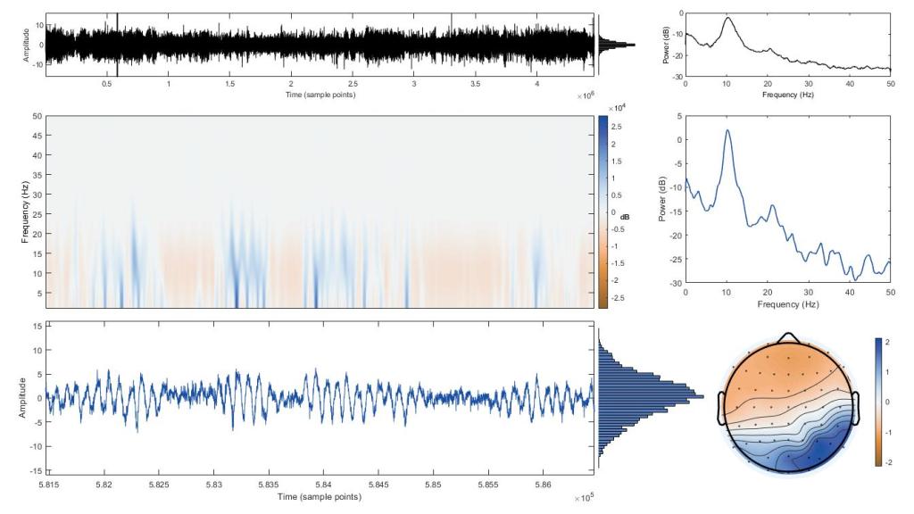
Before:
After:
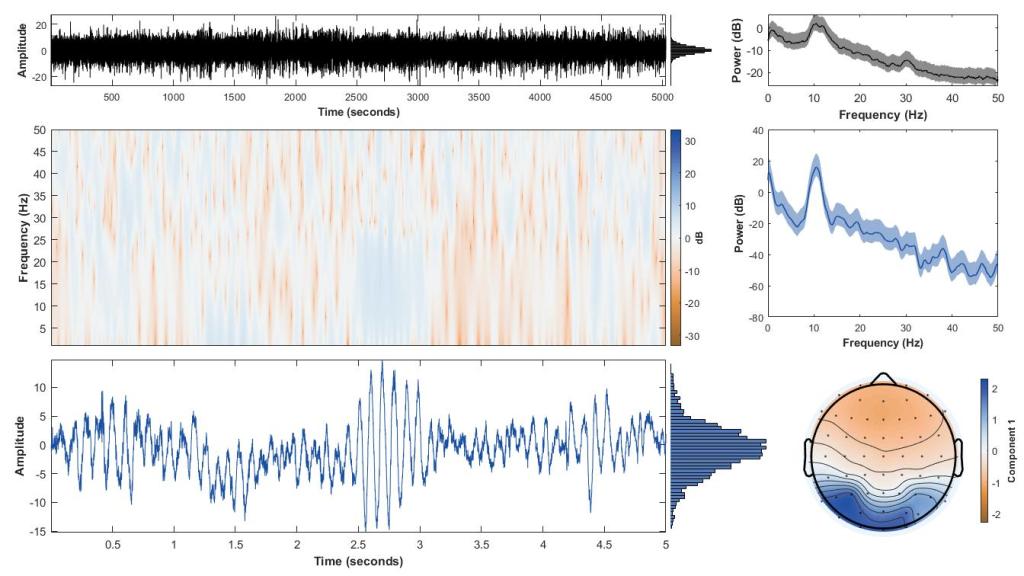
Not the same participant, but similar independent component (read more). There are several oddball additions I’ve made to this, like the topoplot (the bottom right circle, which is actually a head from the top view nose is the triangle looking thing up top and ears are the sides). I added a label so I knew which component I’m looking at (we have 60 so keeping track is important). I rotated the dB label on the color bar for the spectrogram (middle colorful plot on the left) and you’ll notice my scale is now in the actual range it should be and not 3000 or more. The light blue and black shading on the PSD plots (top right and middle right) are the 95% confidence intervals for the data and everything is now in seconds with larger font and bolded labels.
Overall I like to think this was a successful exercise and while I don’t think I’ll ever use these for any sort of publications, it may come in handy if I ever need to do a presentation on the work I’m doing. There’s still a lot left to be done, but at least I can check this off the to-do list and move on to the next task. With that, it’s back to work I go!


Pingback: The long data processing road | Lunatic Laboratories