The art in science
One of the easiest ways to turn even the most advanced scientific paper into something accessible is through carefully crafted figure design. Figures are a way to tell a story, but to also capture the readers imagination. The difference between a scientific figure and a drawing from a story is really just the difference in the information you are conveying. However, as is the case with most things in the world, a “good” figure is in the eye of the beholder.
For the past few months I’ve been doing basically nothing, but trying to make a GOOD figure. Okay, good figureS, as in multiple, but there’s a lot that has to happen before you write your first line of code or put the (virtual) pen to canvas. Just like a good photo takes planning, skill, and a lot of luck, figure design requires all of that and you need to be able to tell the story.
Everyone has a different idea about how much story data visualizations (figures, but I feel like I’m saying figure a lot) should tell, but for me the best figures are standalone, you can look at them and they tell you the story without needing to read the text. You may need to read the figure caption, but other than that, you can understand why the figure was included in the paper without needing to fully read the paper. It’s probably why my figure captions tend to run longer. I like to explain, in detail, what’s going on and why you should care. I’ve run into too many papers where the caption says something like “Fig. 1: growth of that one thing this paper is looking at” without telling me why I should care or why it’s interesting.
Notice how I am using the term figure and not plot. That’s because not every figure is going to show data, sure most will, but some are there to tell you how the experiment was set up or how things were performed. There’s an art there and the best figures to me are artistic. They don’t always need to tell the story better, sometimes a figure can tell the same story, look better, and will capture the reader’s attention more than a figure that was expected or something not as nice looking.
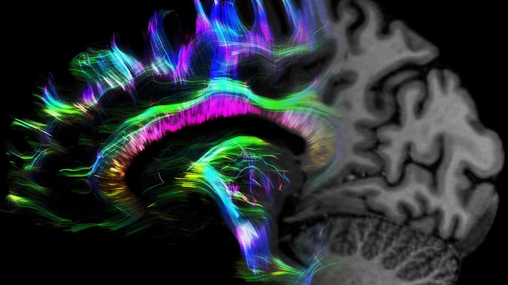
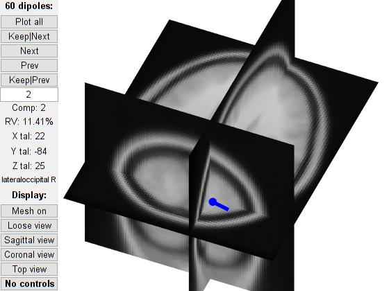
I’ve been working on a set of figures to show activity in the brain. Our lab has a standard and somewhat boring way to show this. Actually if you want an example, I’ve actually shared the template we use (the technical name is the MNI template) and when we show activity in a specific portion of the brain it looks like a side, front, or top view of this (unfortunately this is in a 3-point view, but imagine seeing it from the top or side and you have a good idea of what our figures normally look like.
This is fine because it tells the reader everything they need to know and with a good caption (bad example above, lol) you get the story behind what you’re seeing. This is cool, but it doesn’t look very good (in my opinion) so I came up with a better way of doing this! It looks awesome, again in my opinion, but it doesn’t tell the story any differently. Think of it as changing the animation style of a cartoon, the story doesn’t change, but the look and “feel” of the story does. A lot of what we do is find our “animation style” or the way we like to tell the story and it’s not something that comes naturally to a lot of people (or at least it didn’t for me!).
This is actually one major reason I regret not taking any sort of art classes in undergrad or for most of my grad school career. A lot of the things you learn, composition, colors, etc, are things that help make a good figure great, a boring figure memorable, it’s the difference between someone remembering your work and it getting lost in the background noise. While my figures don’t tell the story better, they are memorable and that’s why my lab was super impressed when I showed them the figures I created. They were impressed more with the style because they had already helped me get the story down correctly.
Which is why yesterday I spent so much time debating about which software to use and a big part of that is data visualization. It’s about organizing the data in the best way possible, or at least a way that gives the needed information to the reader. There’s a lot that goes into selecting that sort of thing, even after you select your figure style you aren’t even close to being done. You need to select the color pallete to use to tell the story and ideally this will be an accessible color palette if you’re relying on colors to tell the story because people are colorblind (like my main-PI for example!) so you need to take that into consideration when selecting colors or patterns to use.
Like I mentioned yesterday, I needed to tell a story and my Co-PI wanted something impressive to use. I’ve since come up with a better way to visualize all the data we wanted to share and I even had some example figures to show my Co-PI today (which made him happy). Even though they aren’t done I’ve got a good idea about the story I want to tell and how I want to share that story with the reader. He’s approved thankfully and now I’m focusing on finishing them up so I can give him a “final” figure. I say “final” because there will inevitably be things that he would want me to change around.
Overall, I’m very excited about this work because I’ve done a lot to make sure that everything we’re doing tells the story the best way possible. Then again that’s the best way possible to me, but just like animation style everyone is going to have a different opinion about it. I’m hopeful that in the end the figures I’m making will tell the story in a way that’s memorable to the reader. Which is why I’m not leaving any sort of tips on how to make the perfect figure here, because the perfect figure is the one that works best for you and your audience. It’s a very personal thing and while I can give general tips (colorblind friendly palettes for example!), there is no surefire way to make a great figure.
Then again, maybe that’s the best tip of all. Making a figure should be a personal conversation between you and the reader, so taking the time to tell the story in a single image is important. The style you use will tell the reader a bit about you and how you think. It’s not always important to have a good style, especially if you’re telling the story clearly, but it doesn’t hurt to have both clarity and style.


But enough about us, what about you?